Designer Doodles
Peter Schreyer
PETER SCHREYER – Chief Design Officer, Kia
I approached Peter on the evening before the Paris Motorshow press day, asking him to sketch a favourite detail from his own work, and then a favourite detail from any car of any era. He started frowning immediately, and was still frowning when I finally buttonholed him with an A4 pad and a propelling pencil (‘No thanks… I’ll use my own.’) late the following afternoon…
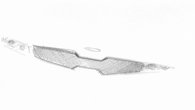
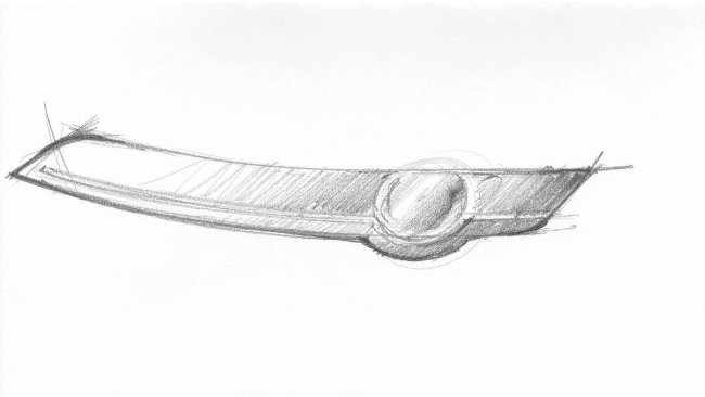
Tiger Nose grille from the current Kia range
Kia means, literally, ‘Rising from Asia’, and the tiger is a powerful symbol of the region; hence Peter’s entirely logical use of its nose (‘Tigers are powerful, yet kind of friendly…’) as a grille-form inspiration. The idea that it’s also a symbol of good luck is erroneous, especially in the context of the tiger itself, since, in large areas of the continent, the consumption of the unfortunate beast’s wedding vegetables -most usually in consommé form- is widely regarded as a sure-fire means to improve the performance of your own…
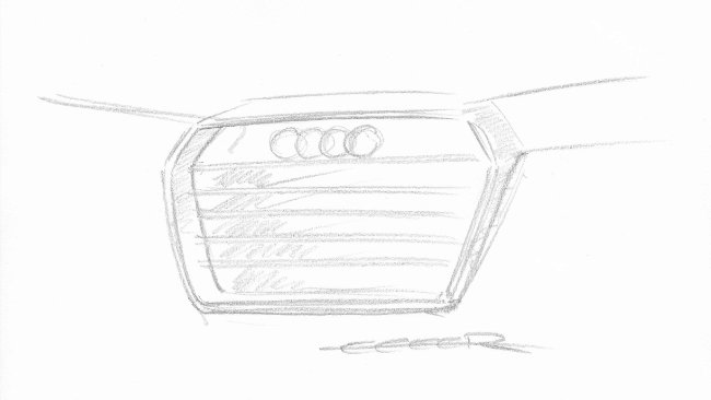
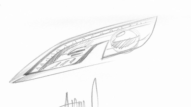
Audi TT air vent
The styling of the Audi TT began in the spring of 1994 at the VW Group Design Centre in California, and it was first shown as a concept at the 1995 Frankfurt Motor Show. Exterior and interior design honours are still credited to more designers than you can shake a stick at, including J Mays, Freeman Thomas, Hartmut Warkuss, Peter Schreyer, Martin Smith and Romulus Rost. On the basis that Peter sketched these air vents, I assume that settles the debate over at least one detail…
Richard Woolley
RICHARD WOOLLEY -Studio Director, Design Research, Land Rover
Before joining Land Rover, Woolley worked in the aerospace industry. As a member of the Land Rover design team for the last 20 years, he has spent time living and working in Germany, Japan and the USA. Most recently, he led the design team that developed the all-new, 2012 Range Rover.
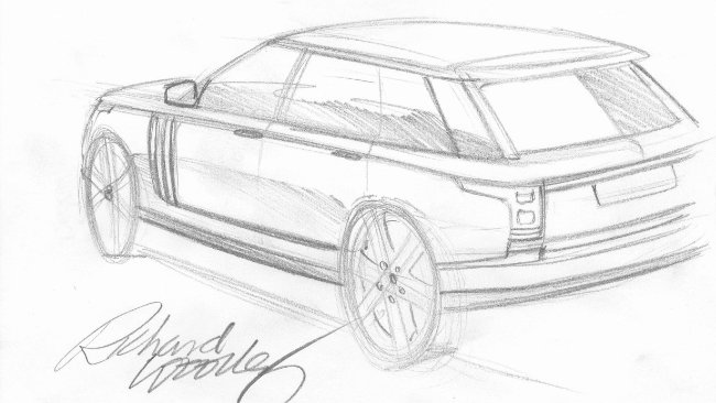
Favourite Current Detail: Rear three-quarter, new Range Rover
‘I led the design team on this car, and am particularly pleased with one particular aspect’; the way the plan shape tapers in the rear three-quarter, in conjunction with the boat hull curve of the profile…’
In a Past Life: De Tomaso Mangusta
‘Beautiful… Clean executions of surfaces and very little in the way of ornamentation. beautiful detailing and a stunning car. The only thing which dates it is the wheel-to-bodywork relationship at the back; the wheel tends to get a bit lost…’
Robert Lesnik
ROBERT LESNIK – Director Exterior Design, Passenger Cars, Mercedes-Benz
Slovenian-born and educated Lesnik took a Transportation Design degree in Germany before joined Volkswagen AG as an exterior designer in 1998. Thereafter occupying several VAG posts, including a final year at the company’s California Design Centre, he moved to Kia Motors’ European Design Centre in 2007. Lesnik joined Mercedes-Benz in 2009. His remit being ‘…a change of strategy; to define something new…’
Favourite Current Detail: S-class Coupe Rear
‘For the Coupe we have moved the number plate down into the bumper to make room for the central three-pointed star, and have two piece lights. This is so untypical of Mercedes saloons to date, but the SL 300 was exactly like this… With Mercedes long, long heritage, there are so many in-house references to choose from.
In a Past Life: Mercedes CLS C219
‘I grew up in Slovenia, with all kinds of little cars, but I remember what an event my first sight of this Mercedes was. The tapering of the body sides towards the rear brought enormous aerodynamic benefits…’
Roberto Giolito
Roberto Giolito – Fiat Head Design
Graduating in Industrial Design in Rome in 1985, Giolito joined the team of one Chris Bangle at Centro Stile Fiat in 1989. Utterly failing to emulate the car designer’s propensity to jump ship with the frequency of nits at a thrash metal concert, there he has remained.
Favourite current detail: Fiat 500 headlamp
Cuter than a basketful of kittens, Giolito’s 2004 Trepiuno concept so artfully aped Dante Giacosta’s remarkable automotive Tardis, the 1936 Topolino (little mouse) that a reprise of the trademark ‘whisker and logo’ badging became inevitable.
In a past life: Fiat Multipla Mk1 gear lever
Strictly speaking, this sketch should be of someone else’s work. But we’ll allow Giolito this indulgence as a reward for bringing a renewed sense of porpoise to the MPV and, for the first time, putting the gear lever in the right place.
Shiro Nakamura
SHIRO NAKAMURA – Senior Vice President, CC0 (Chief Creative Officer) in charge of Design, Brand Champion, Nissan Motor Co Ltd
Sketches:
Own: Infiniti Essence concept car, 2009 Geneva Motorshow.
Favourite: Air vents from 1964 Alfa Romeo Canguro concept by Giugiaro for Bertone. Or, air vents from Ferrari 250 GTO, designer still being haggled over to this day.
Important trend?
‘Exterior not much change at the moment, but interior changes are huge because of the amount of HMI technical development going on…. Autonomous driving… Information technology and connectivity; information is very much more complex which people don’t want. It’s not like an iPhone, which is so simple… How do you balance the numerous functions of information technology with simple, intuitive operation? Even more technology is coming in, so the challenge for a designer today is very much the interior rather than the exterior.
‘Of course the exterior remains important, that’s what people look at first. But if you compare the interior of a 1950s – 60s car; that just has audio. That’s it.’
Danger that we’re losing sight of the fundamental function of a car?
‘Yes, and if you’re after a more driving oriented car I think you have to go back to the basics –Just an engine and three pedals. Once upon a time cars were there to be enjoyed from a driving perspective, but now, largely, they’re just for simple, safe transportation; it’s very different.
But I think that’s the way we have to go. In Japan today, most people don’t enjoy driving. They drive because they need to. Customer demand has become very diversified, and we have to respond to all their different requirements.’
Influence of Chinese market?
‘Certainly, because it’s such a big market. It’s inevitable. They’re more emotional than we Japanese, and that’s reflected in the styling they enjoy. The ‘Friend –Me’ concept on our stand today is a car designed specifically for China. One thing that’s interesting about the interior is that it’s designed for connectivity, and that’s because under China’s One Child policy children in cars do not have a sibling to talk to, so they value connectivity on board to stay in touch with their friends even more highly. Even in Japan the average number of children per family is just 1.2… So we too have plenty of one child families.’
Favourite car?
‘Mini’ AH… Mini. ‘NO; MANY… Too many to choose from. Impossible.’
Simon Lamarre
Simon Lamarre – Exterior Design Manager –C Cars- Volvo Car Corporation
A graduate in Industrial Design from Quebec University, Lamarre clearly feels most at home in the frozen north. He started at Saab in 1992, working as a clay sculptor, before moving to Volvo in 1995, where claims to fame include the exterior design of the C30.
Favourite current detail: V40 ‘Mustache’
City Safe meets Salvador Dali… Much rests on the shoulders of this Movemeber-on-the-move replacement for the S40 and V50 if new owner Zhejiang Geely Holding Group’s commitment to doubling Volvo sales by 2020 is to be realised.
In a past life: Austin Healey 100-4 fold-down windscreen
Over 14,500 Healey 100-4s were built in two series between 1953-56. A two-seat roadster with a glorious purity of line, perfectly captured by Lamarre with no wasted graphite whatsoever.
Stefan Lamm
STEFAN LAMM – Design Director Exterior, Product Development Europe, Ford
(Relentlessly ‘on message’…)
Sketches:
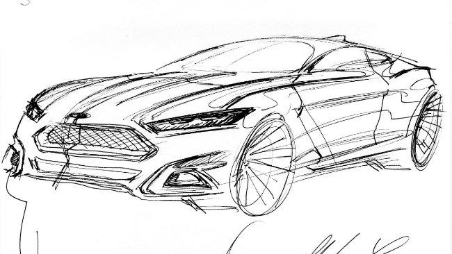
Own: Front three-quarter view of Evos concept car, 2011 Frankfurt Motorshow.
‘A very cool front foglamp bezel detail, in combination with cool, technical-looking headlamps and the Daytime Running Light eyelashes.’
Favourite: Ferrari 288 GTO.
‘A good way to get into car design…’
Important trend?
‘Fuel consumption, and aerodynamics… How we can integrate aerodynamics into the design. And also how you fulfil the need for different customer expectations, which we are dealing with as you see here with the Vignale approach, which is geared to heightening the ownership experience way beyond that which you’d expect from Ford –for those who already buy a top spec’ Mondeo and are now saying, ‘is that it?’. Also there is the need for greater individuality from the customer. So we need to find a good concept to deliver that; a real challenge for the designer.’
Chinese Market?
‘We are quite successful a designing one car that is acceptable throughout the world, rather than having to modify our designs to suit a range of different markets. But it is correct to say there are regional differences, For instance in Asian markets you perhaps need a little more decoration, which they love. Whilst in Europe you need to be a little less in your face. But we can do this with the trim level. Actually I think the different markets are now closer together than they were 10 years ago, because of the internet.
The Asia market is changing very quickly now, and you have be careful not to lose track. But we do a lot of researching, we always have close contact with the markets to get the most current feedback.’
Design trends that transcend brand?
‘Connectivity. And I think we’re one of the leaders in that segment. I haven’t had the time to walk around the show yet, but I do see a trend towards more simplicity in body surfacing in some cars (as well as some opposites). People are tired of all this busy stuff… from Fords point of view we are simply looking for more sophisticated design executions.’
Engineering constraints?
‘I would believe that this is actually more challenging and sometimes drives us towards new design solutions. For a couple of years pedestrian protection was a nightmare for designers, but on the other hand its challenging and somehow you move on… It can also be supporting; for instance you have LED technology in headlamps, which enables you to slim down the headlamp shape as we have on Mondeo. It would be hard for you to find a headlamp that small in height anywhere else in the show.’
Wolfgang Egger
Wolfgang Egger – Head of Audi Group Design
In a career path spookily reminiscent of one Walter de Silva, Egger started at Alfa Romeo in 1989, moved to SEAT in 1998, spent five minutes at Lancia before returning to Alfa in 2001 to pen the stunning Nuvola concept and 8C Competitzione, and succeeded de Silva at Audi in 2007.
Favourite current detail: New Audi grille design
The Crosslane Coupe unveiled in Paris heralds Egger’s revitalisation of the trademark big grille for the next generation of Audis: A rare instance of a logo actually shrinking within an ever bigger, more sculptural maw.
In a past life: Alfa Romeo Villa d’Este grille
The business end of the 6C 2500 SS Coupe Villa D’Este, named after the eponymous Concorso d’Eleganza the car won in 1949. Styled by Touring of Milan, this was the last Alfa model to be built by hand. Just 36 were made.
Alejandro Mesonero Romanos
ALEJANDRO MESONERO-ROMANOS – Design Director, SEAT
(Fine, but a bit corporate. Hates talking as he draws –wants coffee and silence.)
Sketches:
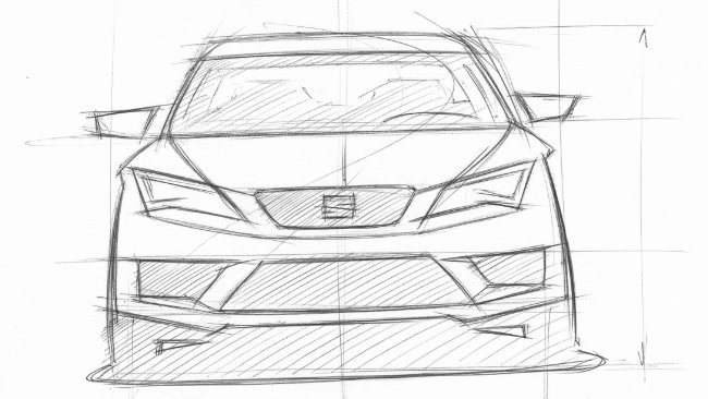
Own: The new face of Seat.
‘It’s very strong and can develop in different categories of car. At the same time, we have a crisper, more precise and more three-dimensional logo. I’d like to reduce the grille further in size, and reduce the headlamps to the minimum.’
Favourite: Porsche 911 rear.
‘I love the 911 and have owned quite a few. I’d actually like to draw the rear of a Jaguar E-Type, but perhaps I’d better stay in-group!’
Important trend?
‘Everything is very open. Of course connectivity is very important… Technology has opened new doors for people, which is good.
But in terms of design, what we can see is that anything is possible. There are people who are trying to look for a new language which expresses new technology like BMW, there are people who are doing retro, which is fine for them, and there are people looking for the next thing, for their own DNA, and then there are those playing with a new design language in terms of surfacing…’
I don’t see any particular trend, apart from looking inwards for their own brand values and trying to express that in the cars, to give more value to the brand in an individual way.’
Common trend?
‘Well, everyone, even those doing low cost cars, they want to appeal to the hearts of the customers through design…. Young, dynamic, sporty… Everyone. And obviously, this is affecting the proportions of the cars. We see cars that have more and more sheet metal on the body side, bigger wheels, better stance. Even the Chinese companies are playing at this, 100%.
It’s a challenge. The game is moving up. Skoda, for instance, is getting more sporty, which means that Seat has to move up also…’
Chinese market?
‘Well I’ve been talking a lot to Chinese journalists to try and understand what they like. And, actually, they basically like what we like. I’m not sure of the extent to which the journalists are representative of the rest of the population, maybe they’re a little bit more informed…
I think that if you’re a strong brand you have to be able to impose your personality wherever you are. Take a strong brand like Apple, they sell an identical iPhone everywhere, they don’t need to adapt it for different markets.
Maybe there’s a 10% modification. They like iPhones with a bit more gold, for instance, more than in Europe. I remember looking at a Chinese airline magazine and the watch brands advertised were the same, but they were all gold. On the flight back, BA, All the watches were silver…’
Engineers?
‘We were talking about my desire to reduce the size of the headlamps as much as possible; that’s one area of conflict with the engineers… However, they know that the car has to sell because it looks fantastic. And that’s down to the architecture, the proportion. If that’s wrong, you’re dead.’
Anders Warming
ANDERS WARMING – Head of MINI Design
Having never wanted to do anything else but design cars, Danish-born Warming has spent his entire professional career with the BMW group; from Designworks USA, via BMW Design to MINI Design, which he has headed up since 2010.
Favourite Current Detail: MINI Clubman Concept
‘This is the rear three-quarter. I love drawing this ‘Shooting Brake’, and that’s spelled correctly. I go to work early to sketch for an hour every morning before the first meeting. Some people go for a run… I have to draw.’
In a Past Life: The Original Mini
‘I’m looking for one now. But it must be a good one. I’m not in a hurry… Or perhaps I’ll just do one up slowly, over time…’
Flavio Manzino
FLAVIO MANZONI –Senior Vice president, Design Director, Ferrari
(Lovely man, but little time and dad dying. Beautiful drawing.)
Sketches:
Own: La Ferrari.
‘When we were working on this car it was very important to find something new for the front. No classical oval but more inspired by the aerodynamic devices of the front.
The aerodynamics of the car are incredibly complex so, actually, the challenge was to keep the shape as simple as possible. Look at the complexities of an F1 car and imagine trying to make that beautiful…’
Favourite: Ferrari 300 P4
‘The face of this car is unbelievable. The iconic form of the front grille is incredibly beautiful and every shape is generated by function –everything from the principal that form follows function. And all hand-beaten panels… Just incredible.’
Frank Stephenson
Frank Stephenson – Design Director, McLaren Automotive
Multilingual child nomad and professional motocross rider, Stephenson joined Ford USA before spending 11 years at BMW and hatching the MINI and X5. A 2002 posting as Director of Ferrari-Maserati Concept Design hatched the F430 and MC12, time at Fiat the Punto and Bravo. A Dennis denizen since 2008.
Favourite current detail: McLaren P1 headlamp detail
The length of time Stephenson spent sketching this logo-inspired headlamp detailing is testament to the complexity of the design. Or perhaps he was just nervous because Ron was standing over him.
In a past life: Mini Cooper exhaust
Someone pointed out to Stephenson that the clay concept he was hurrying to finish lacked an exhaust pipe. He stole a Budweiser can from a colleague, stripped off the paint and rammed it home. Been there ever since.
Giles Taylor
GILES TAYLOR – Director of Design, Rolls-Royce Motor Cars
Yet another Coventry/RCA sausage factory success, Taylor first worked for Citroen between 1992 -97, creating the exterior design concepts for the Xsara and then the C3. Between 1999 and 2009 he was, amongst other things, Chief Designer on both the new XK and new XJ at Jaguar. he joined Rolls-Royce in April 2011.
Favourite Current Detail: Rolls-Royce Wraith
The very essence of a car in just five lines…
‘I joined the team during the clay phase of Wraith as chief of the exterior team, and was responsible for refining line and surface. I do subscribe to the ‘less is more’ theory, but simplicity is a tough on to crack…’
‘This car is a powerful reference to the classic epoch of continental GT motoring; the romantic era of long-distance driving. Glamour is an essential ingredient for a Rolls, but the Wraith is a masculine car. It combines a crisp-cut suit with a little bit of decadence; it loosens the tie and puts a little spirit back…’
In a Past Life: Ferrari 250 SWB
‘I find it a beautiful car to look at… Not a duff angle. The sense of tautness about the body surfacing, so much power in all of the elements, and a wonderfully restrained approach to detailing.’
Giles Vidal
GILLES VIDAL – Vice President of Design, Peugeot
(Great talker. Rarely stays on subject asked.)
Sketches:
Own: Peugeot 308 headlamp detail.
‘’The only external expression on a car of the level of high technology to be found on the inside…’
Favourite: The fact that the bonnet mascot on some French Voisin cars of the 1930s was actually higher than the roof line… And, the roof fin on a Bugatti 57SC Atlantic.
‘Not so much a conceit as simply an inexpensive way of joining two sides of a car. The only car in the world built like this. No one knows precisely why they did it, but I love the character…’
Chat:
The Architect Le Corbusier was fanatical about Voisin cars. The famous 1927 black and white photo of his newly completed Villa Stein at Garches has Corb’s own Voisin in the foreground.
‘What’s interesting is that some 50 year old cars become classics, maybe, but you see some 50 or 80 year old buildings today and you can’t tell, unless you know the story of Architecture… It could have been from yesterday…. Apart from art, the only subject in the world that can be timeless in that way…’
Important trend?
‘Definitely connectivity. Except for that rare occasion when you’re driving down a deserted country lane away from law enforcement and congestion, driving for pleasure these days is a waste of time. And Parisians sitting all day in traffic jams want to do something else whilst they’re in the car.
But there’s a limit to how far you can go, because you still have to concentrate on your driving, even if you’re stuck in traffic. So there’s an issue associated with how much infotainment or connectivity you can put in a car… We now have apps specially adapted for use in the car.
Decision to install small, low steering wheel in Peugeots?
‘We still want driving to be a nice physical experience with the car. With acceleration and speed not really available any more, the feeling of quality and precision in placing the car exactly where you want it on the road is now important.
Also for us ergonomics are very important. It makes more sense to have the IP as high as possible so you spend as little time as possible with your eyes off the road. That led to a smaller, lower steering wheel. We concentrate on what we call the ‘golden triangle’ of steering wheel, IP and Centre console screen. Once we have the ideal positioning of all three relative to each other, then we can concentrate on styling…
Engineering constraints?
‘At PSA we have good synergy with our engineers. Within the constraints of quality and price, we simply try to find the ideal arrangement of what suits both them and us. It works; we are not restricted at PSA.
Between engineering, design and marketing, you have a good product when all three pull on the rope with the same strength. If the engineers dominate, you have a box; a super high quality box. If marketing are in charge it will have the best of everything but will look silly. And if we’re in charge it might be beautifully proportioned, but go too far…’
Chinese market?
‘In the eyes of the rest of the world, it’s the European car market that is exotic, we’re the ones producing the exotic cars. Then again, at Peugeot we want to sell French cars to the rest of the world. We want the Chinese to buy Peugeots precisely because they have that French Peugeot DNA. I don’t think the Chinese people will buy a French car if it’s trying too hard to be Chinese. Then again, we do for sure need to adapt, such as maximising legroom in the back…
In terms of colour and trim we also have to adapt; for example they prefer lighter interior colours like beige rather than the darker European trims we tend to associate with premium quality. Also light colours in Asia are more warm than they tend to be in Europe, where they’re colder.
So, we are global, but we do locally adapt for different markets.’
Ian Callum
Ian Callum – Jaguar Director of Design
Yet another RCA graduate, Callum signalled early intent by submitting a design to Jaguar aged 14. After 11 years at Ford he fled, setting up TWR Design with Peter Stevens and Tom Walkinshaw, only to be reabsorbed when he succeeded the late Geoff Lawson at Jaguar in 1999.
Favourite current detail: Jaguar F-Type rear light cluster
A painstaking rendition of one of the elements that combine to conjure a beautiful rump. Not many cars look better travelling in reverse, but the F-Type is definitely one of them. We suspect Callum agrees.
In a past life: Lamborghini Miura headlamp
Callum agonised long and hard between Ferrari 250 GTO SWB and David Brown grilles, before settling on the Miura headlamp; the ‘eyelashes’ simply serving to disguise humble, Panda origins.
Ivo Groen
IVO GROEN – PSA Programme Design Director
A 1898 Transportation Design graduate of the Art Centre College of Design in California, Groen joined Style Citroen in Paris in 1990, making contributions to the interior and exterior styling of the C6, C5 and C3. In 1999 he was promoted to PSA premium Segment Product Chief Designer, putting 2 Peugeot and 3 Citroens through to production.
As Deputy Director of PSA’s Advanced Styling and Cooperation Studio he was responsible, amongst other things, for the development of the 2005 Peugeot 107, Citroen C1 and Toyota Aygo. In his current position, he is responsible for the new generation of the same cars.
Favourite Current Detail: 108 Katana and headlight details
‘The Katana (Samurai sword) detail in front of the door mirror on the new Peugeot 108. or more accurately, the dagger… A means of visually extending the daylight opening to differentiate the glasshouse profile from Aygo and Citroen, along with the lengthened bonnet detail into the A pillar. The headlight represents premium detailing in a sub-compact car.’
In a Past Life: Lamborghini Espada
‘Can you imagine doing exhaust tips or wheels like this today? I prefer the early models before they sanitised it…’
Joseph Kaban
JOSEF KABAN – Chief of Exterior Design, Skoda Auto
(Quite hard to understand and v corporate)
Sketches:
Own: Bugatti Veyron and its inspiration, the Bugatti Royale.
‘As a designer, you are responsible for maintaining the genetic code of a marque. What interested me about the Royale design is that decoration is as important here as proportion. The Veryon also has two-colour possibilities.
Most supercars today are wedge-shaped, with the point forwards. But in the Veyron the wedge shape is actually backwards to the standard supercar, with the engine, the most powerful in the world, as the heart.’
Interesting to hear Kaban talk about aiming for a design that eschewed ostentation (especially using the Massive Royale as a role model), on the basis that the car was, at the time, so crushingly superior to anything else around that it didn’t need to shout about it. Sadly, he foolishly assumed that the car’s owners would, by nature, all embrace similar levels of taste and discretion…
Favourite: The new face of Skoda.
‘Make the cars as clean and undecorated as possible to reflect their practicality… Coco Chanel said: ‘it’s not fashion. That’s too transient. It’s style…
What you see is what you get. Dependable, understated… A car for normal life, not for attention seekers. Even a Ferrari driver ends up looking for somewhere to put his plastic shopping bag…’
Lance Scott
LANCE SCOTT – General Manager, Design, Toyota Europe Design Development
(A last minute find and inaudible interview)
Sketches:
Own: The Toyota ‘Keen Look’ and ‘Under Priority’ frontal design.
‘We’ve been working on this identity since 1999 with the Yaris. Under Priority came from the aerodynamic requirements of the Prius, whilst the upper part focuses on the logo.’
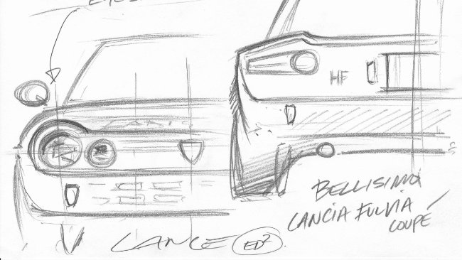
Favourite: Lancia Fulvia Coupe.
‘I bought one of these when I was a young designer. I still own it, but I don’t quite know where it is…’
Important trend?
‘The next one. That’s what were all always looking for; where to take the brand in the future. The next big thing.
HMI very important to the experience. Today people have more interaction with their phones than they do with their cars, so giving them a similar experience through their cars is a key challenge. Today the father will drive the car, but the son is more interested in interacting with it…’
Mark Adams
Mark Adams – General Motors Global Design Director, Cadillac and Buick
Another RCA graduate, Londoner Adams cut his teeth at Ford before joining GM in 2002. Most recently in the spotlight for the creation of a new Vauxhall/Opel design language (‘Sculptural artistry meets German precision’), he also spent five years at Saab from 2004 (Swedish saloon meets bull moose).
Favourite current detail: ‘Shockwave’ detail from Astra GTC and Adam
Replace the door handle with a bullet or jet aircraft and the inspiration for Adams’ ‘shockwave’ detail is instantly apparent. In an age of often pointless metal pressing, he’s rightly proud of this unique detail.
In a past life: Mercedes-Benz 300 SL bonnet blisters
With the 3.0 litre straight-6 canted at 45 degrees in the engine bay to keep the bonnet line as low as possible, there’s something slightly suspicious about the fearful symmetry of the SL bonnet blisters. Gorgeous, though.
Mark Allen
MARK ALLEN – Head of Jeep Design, Chrysler Group LLC
His heart set on a career in automotive design from the age of five, Californian Allen joined Chrysler as a designer in 1994. His design portfolio includes the 2008 Jeep Liberty, 2009 Ram Truck, 2011 Jeep Grand Cherokee and numerous concept vehicles.
Allen also leads the Mopar Underground effort; a small group of enthusiasts who develop four to six concept vehicles each year for the Speciality Equipment Market Association (SEMA) Show, and other speciality auto shows.
Favourite Current Detail: Jeep Forward Control
‘This is a one-off machine we built for the Easter Jeep Safari. We started with a Wrangler and cut it up, moving the cab around until it worked. It’s a carnival ride, it really is… Going uphill is fantastic, but going down is scary as shit… Like you’re riding on the front bumper.’
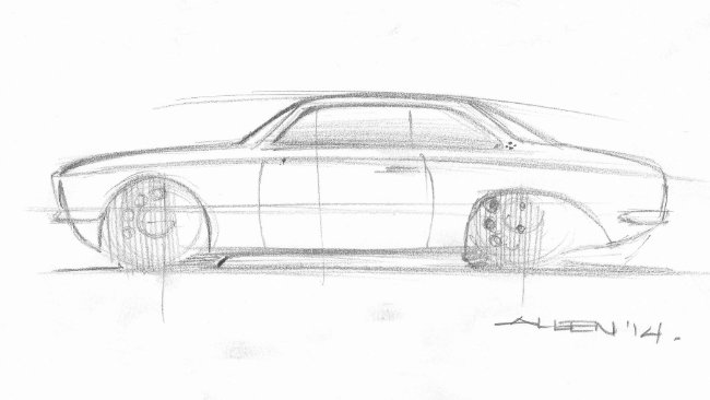
In a Past Life: Alfa Romeo GTV 1969
‘I used to own one of these, and I loved it to death. But I couldn’t drive it work because the smell of carburettor and engine oil stays in your clothes all day…’
Mark Lloyd
MARK LLOYD (talking) and FRED DUVERNIER (drawing)- Head of Styling Strategy and Master Exterior Designer, Citroen
RCA graduate Lloyd began his career in 1984 as an aerodynamics engineer, before working for Jaguar as a designer. He joined PSA in 1989 as an Exterior Designer at Citroen’s Design Centre. In 2005 he was made Head of Graphic Design, running the brand’s international projects, most notably the DS3. Since 2011, he has been in charge of Citroen’s Styling Strategy, which includes the C4 Cactus.
RCA graduate Duvernier spent about 8 minutes as an Interior Designer at Ford before joining Citroen as an Exterior Designer in June 2000. from 2004 to 2006 he worked as Lead Exterior Designer for Nissan, before re-joining Citroen.
Favourite Current Detail: Citroen Cactus
‘We felt it was important to find another pathway in exterior design; there’s a limit to how much you can do with glass, painted metal and lights… Inspired by the Parisian environment of aggressive touch parking, we feel the fourth element is protection, but all based on functional need. Go back thirty or forty years and the bumpers were very much a visible protection element. That’s disappeared now, but why not reintroduce it? This isn’t an urban bias, just everyday life…
The Cactus has a very strong graphic; very black and white. You can draw the car with just a few lines..’
In a Past Life: Citroen DS, Traction and 2CV
‘There’s a powerful link between the simple graphic signature of the Cactus and the few lines needed to draw a Citroen DS, or Traction, or 2CV… We had plenty of time with the Cactus at the clay stage, which was very beneficial in developing a simple but bold graphic signature.’
Michael de Bono
Michael de Bono – BMW Exterior Designer
Young Brit de Bono joined BMW in 2004 after graduating from the Transportation Design Department of Coventry University. After working on various Rolls-Royce and BMW advanced design concepts, he moved to the production design team in 2007, where he penned the pretty 3 Series Touring.
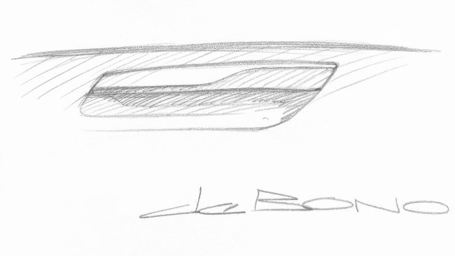
Favourite current detail: Concept Active Tourer Door Handle
BMW’s first front-wheel drive vehicle (assuming they build it), the Concept Active Tourer made its world debut at the 2012 Paris Motor Show. Not quite sure why de Bono chose the door handle since, at interview, he cited the wrap-over kidney grille as a favourite.
In a past life:1936-1940 BMW 328 Kidney Grille
Body designed by Peter Szymanowski the 328 had an extremely successful racing career. After the war, one of the Mille Miglia 328s, technical drawings of the car and engineer Fritz Fiedler were extracted from the bombed BMW factory by the Bristol Aeroplane Company. Next stop, the Bristol 400.
Michael Mauer
MICHAEL MAUER – Vice-President, Porsche Style
Mauer studied Automobile Design at Pforzheim Polytechnic from 1982 to 1986 before Securing his first job at Mercedes-Benz. In 1989 he was appointed Design Project Leader for the first SLK. In 1995 a Head of Department role entrusted him with design responsibility for the A-class, SLK and SL models. He moved to the M-B Advanced Design Studio in Tokyo in 1998 and, a year later was put in charge of Design MCC Smart GmbH. In 2003 he was appointed Executive Design Director at Saab, also responsible for Advanced Design at general Motors Europe since 2003. He joined Porsche in 2004.
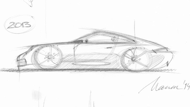
Favourite Current Detail: The 911
‘We celebrated 50 years of the 911 last year. This is the F model 991 from ’63 and the latest 991. The proportions and angles have changed but some things remain the same, such as the Daylight Opening always finishing on the centre of the rear wheel…’
In a Past Life: Old car proportions
‘What I really love are proportions from old cars. No overhangs, huge wheels…’
Peter Birtwhistle
PETER BIRTWHISTLE – Design Manager, Mazda Motor Europe
(Good chat…)
Sketches:
Own: Air vents, SWB Audi Quattro.
‘The car came about because the Peugeot 205s were winning everything in 1985-86, and Hannu Mikkola said the wheelbase of the standard Quattro was too long. He also said the windscreen was too raked and he was having problems with the glare of flash photography after dark…
The SWB car is actually an Audi 80 body, which had a more upright screen, with a raft of carbon fibre body panels added on. The ting need so much air the front is all holes…’
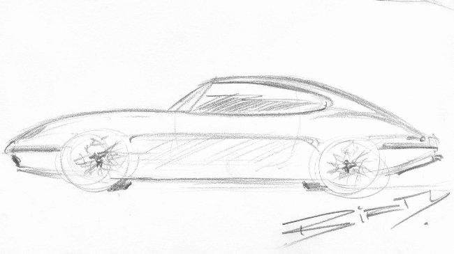
Favourite: E-Type Jaguar.
‘The most important thing for me is proportion. So, as an Englishman, I always think E-Type Jag. For me as a young kid; seeing the first E-Type… It was like a racing car… I don’t think you get that sensation these days because you’ve already been force-fed so many images on the internet before you see something in the flesh for the first time.’
Important trend?
‘Obviously HMI is important; interior design having to integrate all these systems that are supposed to make driving easier for you. It’s still a big bag of worms, though. They’re still developing the software for so much of this stuff…
I actually prefer an analogue radio with a big, physical button that’s got ‘1’ on it. A lot of works very well in the laboratory, but out on the road…
I bought my daughter a car when she passed her driving test. It didn’t have air conditioning and it didn’t even have electric windows. She got in and didn’t know how to open the windows. I told her she had to wind the handle She said: ‘WHAT?!?!’
I’ve got colleagues working on cars that drive round cities themselves, without the driver having to do anything at all. Set you navi and just sit back. Next year they’re going to drive a group of 10 BMWs from Munch to Lake Garda without any drivers…
Now, they say that those cars can’t crash. In which case you don’t need bumpers, you don’t need safety belts, you don’t need airbags (until a bloody tractor pulls out!). So that would put a completely new perspective on interior design. You don’t need to have any controls, you can swivel the front seats… maybe the controls for the car in the centre and everyone sits round them…
Not going to be for everything, and you probably wouldn’t buy something like that, you’d book it or lease it. Still gets you from A to B in a private environment which is what people like about cars. Petrolheads like me wouldn’t relate to that though, we still want to get in a car and drive it…’
Peter Horbury
PETER HORBURY –Head of Design, Geely
(Impromptu meeting promotes impromptu chat)
Sketches:
Own: KC concept car dashboard and bridge that inspired it. Geely Grille. Geely Upholstery.
Chat was all about looking for a new, properly Chinese, Geely brand image, without resorting to Pagoda roofs and Panda pelt upholstery…
‘This is a bridge in a park in Hangzhou, reflected in the water. We used this exact shape for the dashboard of the showcar, because then we have a story. There was nothing about the brand, no history. But Geely is based in what was once the capital of China… Lots of legends and mythology. So immediately we have a base; the place we’re from.
The grille combines chrome spears with a dragon’s face, or a Chinese theatrical mask with the eyes underlined. The rings are ripples moving outwards from a leaf floating on water…
The wheels have alloy spokes based on the shape of a Chinese sword we came across in a local museum. And the seat stitching is instantly identifiable as the crossover fastening of traditional Chinese attire… We even have jade ornamentation.
Little signatures imbuing the car with a sense of place…’
Then there are a couple of sets of sketches showing how the difference between English and Scandinavian furniture design of the 50s inspired a different approach to automotive design during the same period… Quite fun.
Favourite: Jaguar E-Type, rear three-quarter.
‘Has to be the coupe, not the convertible…’
